Conceptual framework for integration and analysis of relevant clinical data
7.3 Patient-Centered Cognitive Support Tools
7.3.1 The Challenge of Data Overload
The way information is currently presented to clinicians and physicians does not support effective problem solving; care providers are faced with a massive amount of information and insufficient tools to make sense of it. Right now, most of the data and information in the intensive care unit (ICU) exists in a very raw state at the level of individual test results and observations, multiple individual clinician notes, and scores of other records, most of which are presented as text. Patients in critical care units accumulate immense amounts of data in their electronic medical records. Electronic health record visualization of patient physiology in the intensive care unit remains simplistic, typically involving tables or time-series plots (see, e.g., [6]). Typically patient measurements are presented in a table and visualized with stacked univariate time-series plots [6]. To form a diagnosis, physicians and clinicians must look at all of this information in separate applications or on different monitors and integrate it in their heads. This means that limited cognitive and temporal resources are taken away from diagnosis and care and given to information retrieval and consolidation.
Although the amount of data stored is increasing, human capacity for attending to the relevant information has remained unchanged [7]. The increasing gap between the amount of data and human ability to find what information is relevant to the current situation can lead to critical incidents and accidents [8]. Trained experts are very good at shifting through and disregarding information to find meaning in data [8]; however, the way information is represented affects this problem solving [9]. Therefore, to find meaning in the mass of data, the information must be effectively arranged to support the cognitive process [10, 11].
Although physicians and clinicians are highly trained, capable, and motivated, this mass of data makes it nearly impossible to transform data into insight, obscures a holistic view of the patient, hides the development of trends, makes it difficult for clinicians to notice interactions between different variables, and can even obscure such apparently simple tasks as the planned daily goals for each patient. Further complicating matters, ICU physicians and nurses care for multiple such patients concurrently, and the cognitive/data burden placed on a physician covering at night or on a weekend, who in theory must absorb all this data with no historical background, is even more overwhelming. This problem is not likely to go away without well-designed technological interventions because the amount of data will only increase in the future.
There are several challenges to representing multivariate patient data in a single visual display. Physiological data has a dense structure due to its volume and high dimensionality making it challenging to enable users to explore relationships intuitively and interactively while maintaining the intrinsic physiologic meaning of specific measurements [12]. Furthermore, different arrangements and ordering of measurements in a display significantly impacts the visualization and the conclusions likely to be drawn from the display [13]. Graphic attributes that make up ICU visualizations must be chosen careful to avoid inducing cognitive overload—the problem it is meant to solve—created by combining too many elements into a single display [14].
7.3.2 An Approach to Designing Patient-Centered Cognitive Support Tools
One technique for developing effective data visualization tools within sociotechnical systems, like healthcare, is to apply a human-systems integration approach. In this approach, we focus on not only understanding how information should be presented to support the clinician in making care decisions, encouraging collaboration among the care team, and promoting a better understanding of the patient’s state, but we also focus on how the care team can interact with the information to derive insight from it beyond what would be possible through looking at data from each device independently.
This approach is critical to the design of effective integrated solutions because it lays the foundation for understanding the requirements of the ICU environment, the needs of the system’s users, and how to translate those requirements into a prototype interface design. There are a variety of tools and techniques that can be applied to the design process that range from structured approaches like the cognitive work analysis (CWA) [15] to semi-structured ethnographic approaches (see, e.g., [16]) to guided application of principles (e.g., human-computer interaction and user interface design) (see, e.g., [17]). Here, we provide a brief overview of some of these principles.
A cognitive work analysis (CWA) is a method specifically designed to provide more effective support to clinicians, including the development of effective information visualization solutions [15]. CWA is a five-step process composed of (1) work domain analysis, (2) control task analysis, (3) strategies analysis, (4) social organization and cooperation analysis, and (5) worker competencies analysis [18]. Although CWA methods were not developed specifically for healthcare, they have been successfully applied in a variety of cases (see [19, 20]).
Cognitive artifacts can be used as tools for understanding clinician cognition and work. Cognitive artifacts can include schedules, clinician notes, lists, annotations, or other writings [21–23]. These artifacts are useful in not only understanding how clinicians think about patient care but can also be used to understand teams and collaboration among team members [22]. Collins et al. [24] provide a detailed account of how cognitive artifacts can be used to understand cognition in order to build new health IT solutions. Using and understanding cognitive artifacts can be used along with other methods like the CWA to design solutions, but typically cannot be used alone for the development of robust visualization solutions.
Workflow and hierarchical task analyses are typically used when we want to understand how people interact with tools or within locations. HTA is a six-step process that includes the following steps: (1) identify the task goal, (2) identify steps to achieve the goal (subgoals), (3) define circumstances and orderings of tasks as a plan for meeting the overall goal, (4) identify if the subgoal needs to be further broken down, (5) if the subgoal needs to be broken down, repeat step 2, and (6) end the process when sufficient detail is reached [25, 26]. Several studies have successfully demonstrated the use of HTA or workflow analysis in the healthcare domain (see, e.g., [25, 27]). One limitation of HTA is that it is typically used for already developed tools. This technique could be applied along with the CWA and is typically thought of as somewhat of a sub-task within the CWA.
Applying user interface (UI) design principles and usability testing is an important process in the development of human-centered information visualization solutions (see, e.g., [28, 29]). UI design principles are typically employed once other techniques like the CWA are conducted so that the visualizations developed meet the needs of the user and are useable. There have been numerous demonstrations and applications of UI principles to healthcare (see, e.g., [30–33]). Applying good UI design principles and conducting user testing is critical to the successful implementation of any visualization.
7.4 Integrating Computational and Statistical Approaches
7.4.1 Data Processing and Conditioning
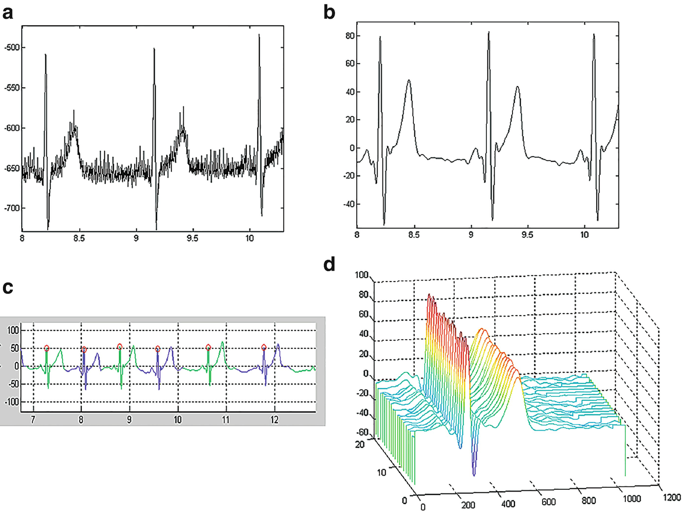
Exemplar ECG processing: (a) Raw ECG trace, (b) filtered ECG signal, (c) identifying the fiducial points, such as the QRS complex facilitates segmentation of individual heartbeats, and (d) waterfall visualization of the heartbeats reveals the morphology
The goal in processing and merging the various data sources depends on the clinical needs. At a fundamental level, the processing and analysis can support two types of inference: assessments and alerts. An assessment estimates the current state of the patient. Assessments can support diagnostic procedures or an evaluation of the effects of treatment. In either case, the goal is to evaluate and understand the current state of the patient. The goal of alerting is to flag a significant change in the patient state. The methodological approaches differ for these two types of inference. Performing an assessment will consider an explicit period of time and seek to answer a specific clinical question. An alert seeks to automatically analyze the data streams to warn the clinician of an important change in the patient’s state. Two examples will clarify the distinction.
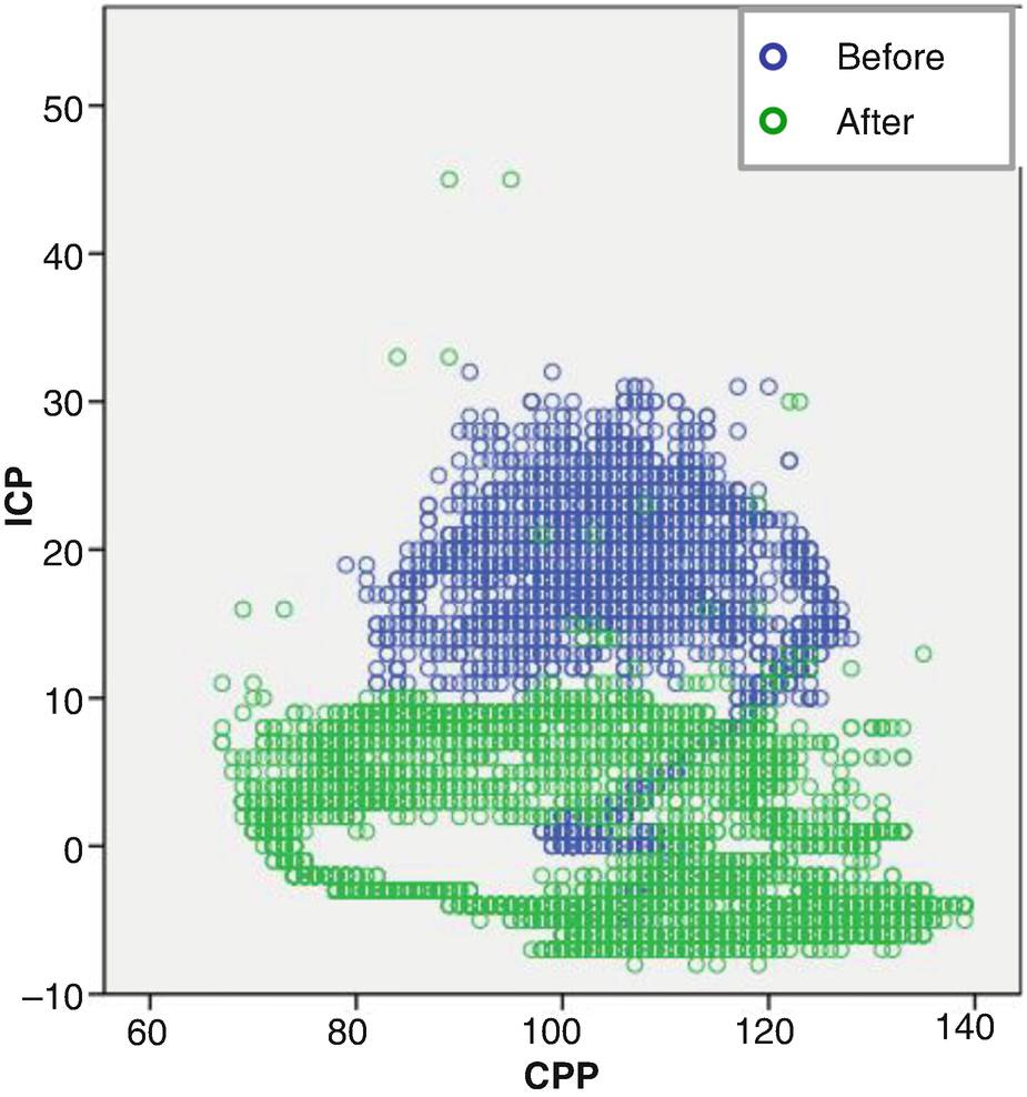
Relationship between intracranial pressure (ICP) and cerebral perfusion pressure (CPP) before and after administering mannitol
Stay updated, free articles. Join our Telegram channel

Full access? Get Clinical Tree


